● 가상요소
1. before
- 해당 요소 앞에 넣고 싶은 속성
2. after
- 해당 요소 뒤에 넣고 싶은 속성
● HTML5와 시맨틱 태그
- HTML5에 도입된 시맨틱 태그는 개발자와 브라우저에게 의미있는 태그를 제공한다.
※ 시맨틱 : "의미, 의미론적인"
● 태그의 종류
- <div> : non-semantic 태그, 안에 들어갈 의미를 크게 유추하기 힘들다.
- <header>, <footer> : semantic태그, 특정 형태의 글이 포함될 것이라는 유추가 가능하다.
(1) header : 상단, 헤더를 의미
(2) nav : 메뉴, 내비게이션을 의미
(3) aside : 사이드에 위치하는 공간을 의미
(4) section : 여러 중심 내용을 감싸는 공간을 의미
(5) article : 글자가 많이 들어간 부분을 의미
(6) footer : 하단, 푸터를 의미
실습(미디어 쿼리 & 가상요소)
<!DOCTYPE html>
<html>
<head>
<meta charset="UTF-8" name="viewport" content="width=device-width, initial-scale=1">
<title>미디어 쿼리</title>
<style>
	body {
		background: #03cc2c;
		color: #fff;
	}

	/* 가상요소 */
	/* 해당 요소 앞에 넣고 싶은 속성 */
	h1::before {
		content: "1. ";
	}

	h1::after {
		content: "- 기본";
	}

	/* 데스크탑  1025px ~ 1280px*/
	@media (max-width: 1280px) {
		body {
			background: #37cff0;
		}

		h1::before {
			content: "2. ";
		}

		h1::after {
			content: "- 1025px ~ 1280px";
		}
	}

	/* 노트북 961px ~ 1024px*/
	@media (max-width: 1024px) {
		body {
			background: #1f23e0;
		}

		h1::before {
			content: "3. ";
		}

		h1::after {
			content: "- 961px ~ 1024px";
		}
	}

	/* 노트북 769px ~ 960px */
	@media (max-width: 960px) {
		body {
			background: #880e4f;
		}

		h1::before {
			content: "4. ";
		}

		h1::after {
			content: "- 769px ~ 960px";
		}
	}

	/* 태블릿 577px ~ 768px*/
	@media (max-width: 768px) {
		body {
			background: #ff4b4b;
		}

		h1::before {
			content: "5. ";
		}

		h1::after {
			content: "- 577px ~ 768px";
		}
	}

	/* 모바일 0 ~ 576px */
	@media (max-width: 576px) {
		body {
			background: #000;
		}

		h1::before {
			content: "6. ";
		}

		h1::after {
			content: "- 0 ~ 576px";
		}
	}

</style>
</head>
<body>
	<h1>미디어 쿼리</h1>
	<p>미디어 쿼리는 화면 크기에 따른 각각의 속성 값을 지정하여, 여러가지 화면을 구성하는 기술이다.</p>
	<p>@media only all and(조건문){실행문}</p>
	<ul>
		<li>@media: 미디어 쿼리가 시작됨을 표시</li>
		<li>only: 미디어 쿼리 구문을 해석하라는 명령어(생략 가능)</li>
		<li>all: 미디어 쿼리를 해석해야 할 대상을 나타냄(생략 가능)</li>
		<li>and: 앞과 뒤의 조건을 나타낸다(생략 가능)</li>
		<li>(조건문): 해당 조건을 설정, max-width: 이하, min-width: 이상</li>
		<li>{실행문}: 조건에 따라 실행할 스타일 설정</li>
	</ul>
</body>
</html>

실습(HTML5와 시맨틱 태그)
<!DOCTYPE html>
<html>
<head>
<meta charset="UTF-8">
<title>HTML5와 시맨틱 태그</title>
<style>
	body {
		width: 440px;
		margin: 0 auto;
	}

	header, nav, section, article, aside, footer {
		width: 400px;
		margin: 4px;
		padding: 4px;
		background-color: #ddd;
		text-align: center;
	}

	aside {
		float: left;
		width: 84px;
		height: 60px;
	}

	section {
		float: left;
		width: 300px;
		height: 60px;
	}

	article {
		width: 292px;
		background-color: #efefef;
	}

	footer {
		clear: both;
	}
</style>
</head>
<body>
	<header>header</header>
	<nav>nav</nav>
	<aside>aside</aside>
	<section>
		section
		<article>article</article>
	</section>
	<footer>footer</footer>
</body>
</html>

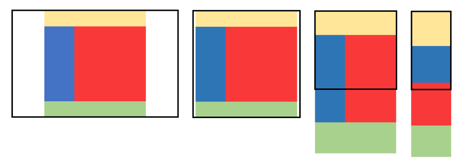
실습(시맨틱 태그 - 반응형)
<!DOCTYPE html>
<html>
<head>
<meta charset="UTF-8" name="viewport" content="width=device-width, initial-scale=1">
<title>시맨틱 태그 - 반응형</title>
<style>
	body {
		background: #e0f2f1;
	}

	div#wrap {
		width: 1200px;
		margin: 0 auto;
	}

	header {
		width: 100%;
		height: 150px;
		background: #fff9c4;
	}

	aside {
		float: left;
		width: 30%;
		height: 700px;
		background: #1e88e5;
	}

	section {
		float: left;
		width: 70%;
		height: 700px;
		background: #f44336;
	}

	footer {
		clear: both;
		width: 100%;
		height: 150px;
		background: #8bc34a;
	}

	/* 노트북: 1220px */
	@media (max-width: 1220px) {
		div#wrap {width: 95%;}
	}

	/* 테블릿: 768px */
	@media (max-width: 768px) {
		div#wrap {width: 100%;}
		header {height: 300px;}
		aside {height: 900px;}
		section {height: 900px;}
		footer {height: 300px;}
	}

	/* 모바일: 480px */
	@media (max-width: 480px){
		header, footer {height: 400px;}
		aside, section {float: none; width: 100%; height: 400px;}
	}

</style>
</head>
<body>
	<div id="wrap">
		<header></header>
		<aside></aside>
		<section></section>
		<footer></footer>
	</div>
</body>
</html>
'웹 개발 > CSS' 카테고리의 다른 글
| [Web_CSS] 07 (0) | 2022.04.25 |
|---|---|
| [Web_CSS] 06 (0) | 2022.04.24 |
| [Web_CSS] 05 (0) | 2022.04.23 |
| [Web_CSS] 04 (0) | 2022.04.22 |
| [Web_CSS] 03 (0) | 2022.04.21 |


